Spin the Canvas: How Album Art Became the Most Exciting Design Medium Nobody's Talking About
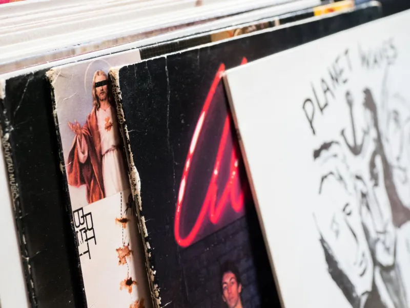
There's a moment that happens to almost everyone who buys a record these days. You slide it out of the bag, hold it at arm's length, and just—look at it. Not because you're reading liner notes or checking the tracklist. You're looking because the thing in your hands is genuinely beautiful. Maybe even a little startling. That's not an accident.
Vinyl's comeback has been well-documented at this point, but the conversation rarely lingers on what's happening visually. Because while the music press has been busy celebrating the return of analog warmth and the ritual of dropping a needle, a quieter revolution has been unfolding in the design studios and screen-printing shops attached to independent labels across the country. The album sleeve—once dismissed as pure packaging—has become one of the most creatively fertile formats in graphic design right now.
The Void That Streaming Left Behind
It's worth pausing on why this matters. When Spotify and Apple Music ate the music industry's lunch, they didn't just change how we consume sound. They effectively erased music's visual identity. A 3,000-by-3,000-pixel JPEG on a phone screen isn't a design object—it's a thumbnail. The tactile relationship between a listener and an album's visual world collapsed almost entirely.
That erasure, weirdly, is what made physical art feel precious again. Designers who grew up in the streaming era are now treating the 12-inch sleeve with a kind of reverence that their predecessors never needed to manufacture. The constraint of the format—roughly 144 square inches, often printed on textured or uncoated stock, sometimes with gatefolds, inserts, and inner sleeves to play with—reads less like a limitation and more like an invitation.
"When I'm designing for vinyl, I'm thinking about how it feels in your hands before I'm thinking about how it looks on a screen," says Mara Delgado, a Brooklyn-based illustrator and designer who's done sleeve work for several indie labels out of the Northeast. "There's a physicality to it that forces you to slow down. You're designing for someone who already made a deliberate choice to buy something physical. They're ready to pay attention."
Typography as Texture, Illustration as Atmosphere
What's striking about the current wave of vinyl design is how far it's drifted from the clean, algorithmic aesthetics that dominate digital music spaces. The designers doing the most interesting work right now are reaching backward and sideways simultaneously—pulling from mid-century European modernism, risograph printing traditions, hand-lettering, even woodblock techniques—while assembling it all into something that feels distinctly contemporary.
Risograph printing, in particular, has become something of a signature for the vinyl design underground. The process produces a slightly grainy, layered quality that photographs can't fully replicate—colors bleed into each other in ways that feel organic rather than engineered. For small-run pressings, it's practical. For the aesthetic it produces, it's practically perfect.
Then there's the typography. Where streaming-era design tends toward legibility above all else—big, bold, readable at thumbnail scale—vinyl sleeve typography is getting weird in the best possible way. Designers are stacking letterforms, running text vertically, embedding titles into illustration, or ditching conventional hierarchy altogether. The sleeve for a recent release from a Chicago ambient project featured no artist name on the front at all—just a dense, layered illustration that unfolded its credits across an elaborate inner sleeve. It sold out in a weekend.
Collectors, Variants, and the Art Object Economy
The collector market is accelerating all of this. Limited-edition color variants have been a staple of vinyl culture for years, but what's newer is the premium placed on sleeve design itself. Labels are commissioning multiple cover variants—different illustrations for different pressings, alternate colorways, hand-numbered editions with original prints tucked inside. Some releases now come with signed art prints that cost more than the record itself.
This isn't just nostalgia economics. It reflects a genuine shift in how a certain kind of music listener thinks about what they're buying. The record is no longer just a delivery mechanism for audio. It's an artifact. A designed object that lives on a shelf, gets pulled out and passed around, anchors a room's visual identity.
"I've had people reach out to me specifically because of sleeve work, not because of the music," says designer and printmaker Theo Okafor, who splits his time between Austin and Los Angeles and has built a small but devoted following through his label packaging work. "They found the record in a shop, bought it because the art stopped them, and then got into the band. That used to feel backwards. Now it feels like exactly how it should work."
Where Fine Art and Commercial Design Stop Being Different Things
What's most interesting about this moment isn't just the quality of the work—it's the blurring of category. Designers like Delgado and Okafor aren't making a clean distinction between their sleeve commissions and their gallery work. The same visual language moves between both contexts. Prints from sleeve projects end up in shows. Techniques developed for gallery pieces migrate onto record packaging.
Some galleries are starting to catch on. A handful of spaces in cities like Portland, Philadelphia, and Detroit have mounted shows specifically around album art—framing original mechanicals, printing proofs, and final sleeve designs alongside the records themselves. It's a niche, but it's a growing one, and it points toward a cultural legitimacy that sleeve design hasn't historically enjoyed.
There's something almost poetic about it. The CD killed the album sleeve. The MP3 killed the CD. Streaming made visual music identity almost meaningless. And then vinyl came back, and with it, the slow realization that the cover of a record might be one of the last places in popular culture where a designer gets to make something that people will actually hold, study, and keep.
Why This Is the Format to Watch
If you care about visual culture—and if you're reading Arvanon, you probably do—the album sleeve deserves a spot in your attention alongside whatever's happening in gallery spaces and editorial illustration. The work being made right now is ambitious, often genuinely strange, and shaped by a constraint that forces clarity of intent in a way that open-canvas formats don't always demand.
The next time you're in a record store, flip through the new arrivals and actually look at what's in your hands. Someone spent real time on it. Someone made choices about color and type and image that were meant for exactly this moment—you, standing there, deciding whether to take it home.
That's not packaging. That's a pitch for your attention, made by hand, printed on paper, designed to last.
Pay attention back.